won "Design for a Better world awards 2021" prize
Who they are
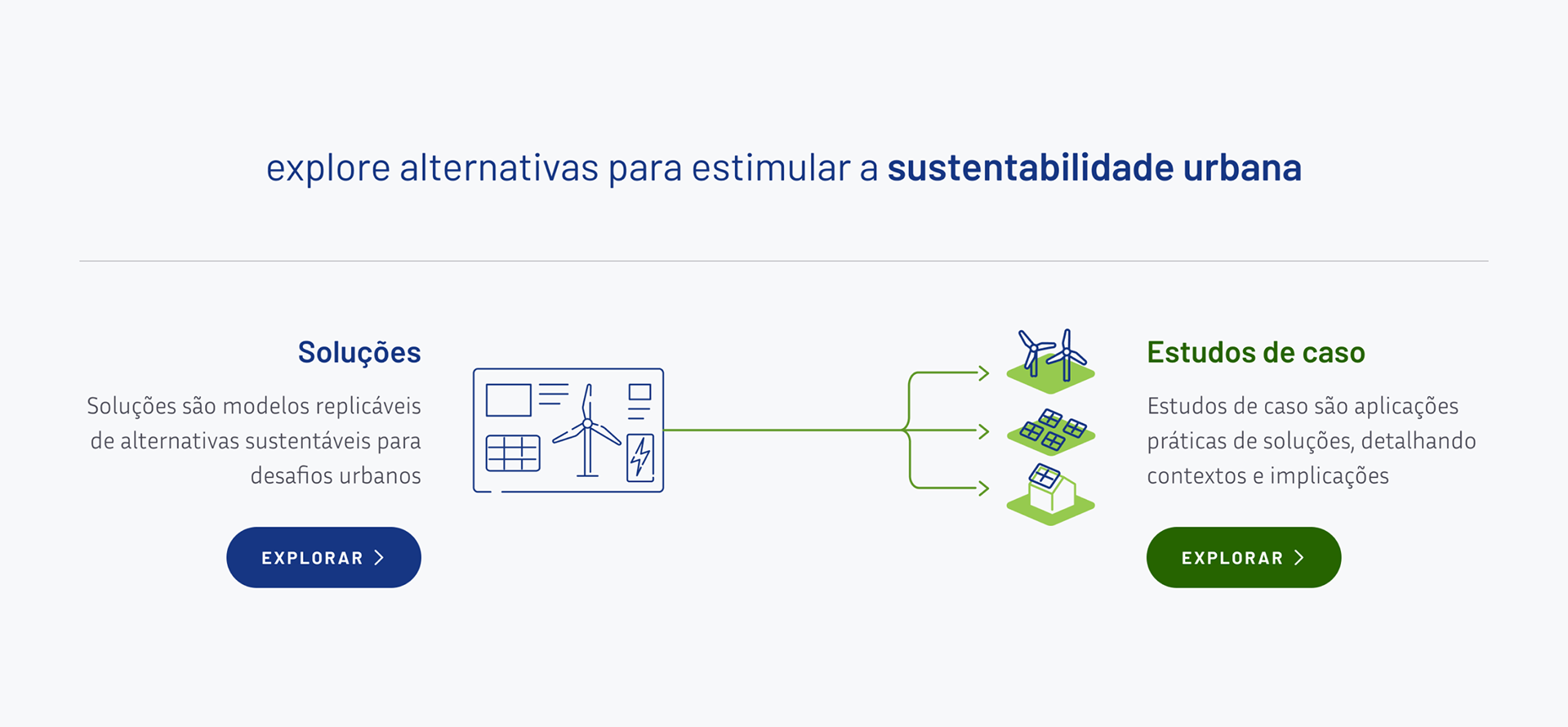
The Innovation Observatory for Sustainable Cities strives to accelerate innovation in Brazilian cities and support evidence-based decision making. The goal is to articulate with public managers, civil society, companies and academia in favour of the urban agenda, co-creating alternatives for the transition of Brazilian cities towards sustainability. The Observatory digital platform works as a large catalogue of references of innovative solutions applied both in Brazil and abroad, which can be replicated in the Brazilian local reality.
Vídeo explicativo do OICS, produzido por nossa equipe / IOSC explainer video made by our team
Context
• They already had an MVP implemented.
• Problems of both positioning and brand image as well as usability of the platform.
• We were hired to work on these two areas, redesigning and expanding the platform.
• Problems of both positioning and brand image as well as usability of the platform.
• We were hired to work on these two areas, redesigning and expanding the platform.
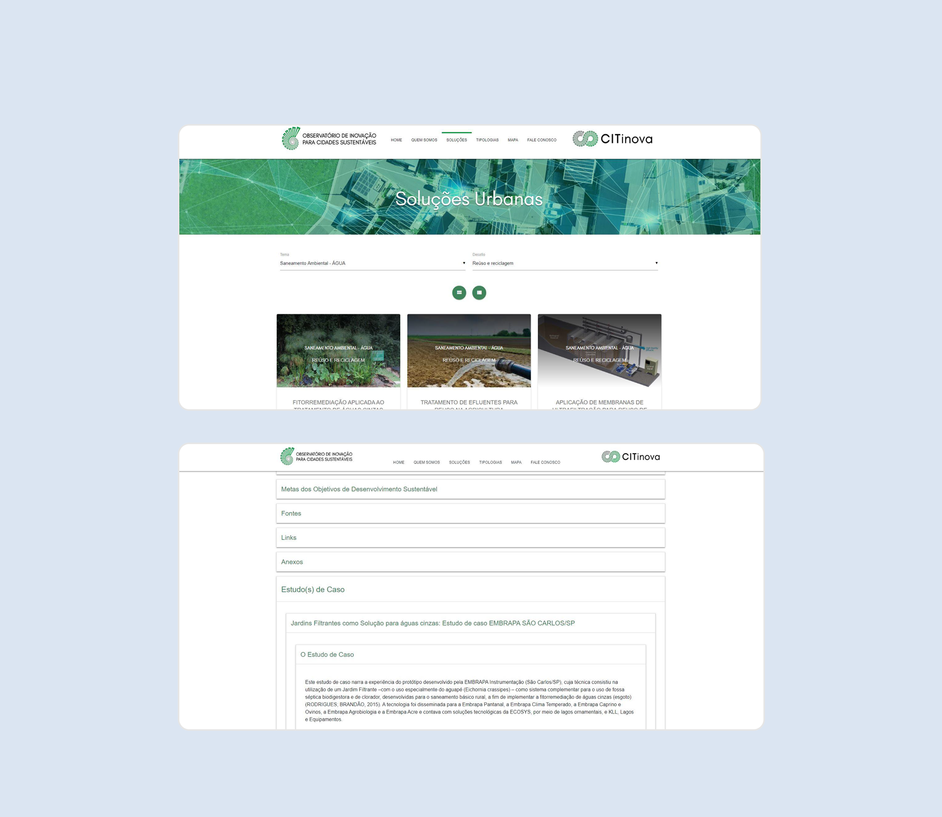
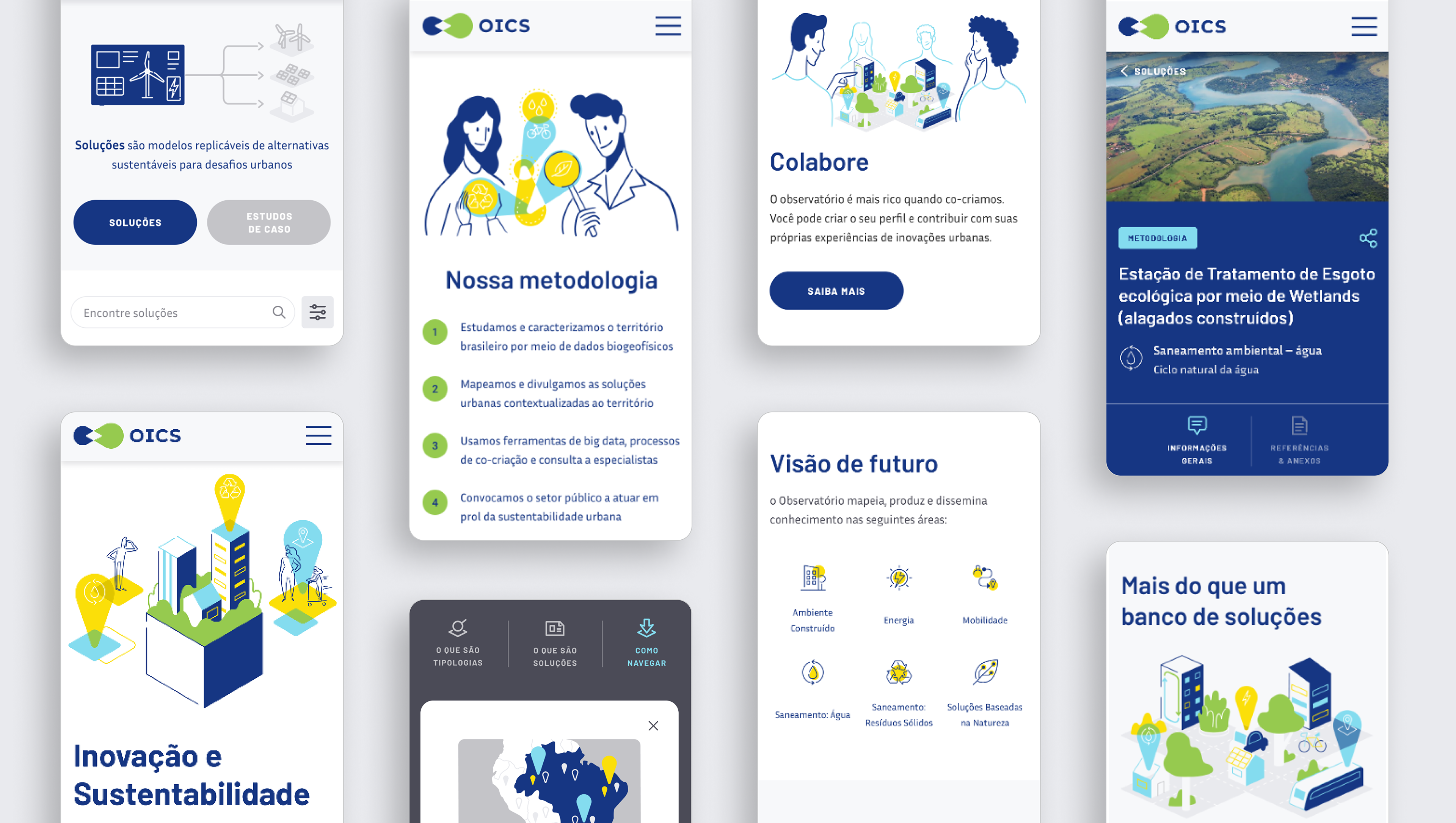
versão antiga da plataforma / Platform old version
Briefing
vision
• To get recognition and be a reference in the area.
• To be a safe place for the public manager to seek information on sustainable urbanization.
• To be a safe place for the public manager to seek information on sustainable urbanization.
Target audience
• Focus on brazilian public managers that deal with urbanization.
• Secondary audience would be NGOs, Academic profile, researchers, universities.
• Secondary audience would be NGOs, Academic profile, researchers, universities.
Problems
• Brand positioning was not in line with the target audience and purposes of the platform.
• Platform had old, bureaucratic language.
• Hierarchy was lacking and more important content was difficult to access on the platform.
• Platform had old, bureaucratic language.
• Hierarchy was lacking and more important content was difficult to access on the platform.
Possible solutions
• More inviting and less technical language to reach other audiences
It needed to have a more modern face, which represented better innovation.
• Show that the platform is alive and always being updated.
• Create a light interface with a focus on accessing the information the user needs the most.
It needed to have a more modern face, which represented better innovation.
• Show that the platform is alive and always being updated.
• Create a light interface with a focus on accessing the information the user needs the most.

entrevistas com usuários / user interviews
Interviews
We selected five users with a technical profile representing the target audience. The interviews were carried out with the following objectives:
• Collect technical insights and suggestions related to the observatory areas.
• Understand needs, difficulties and possibilities of use to improve the user experience on the platform.
• Collect information to define different profiles that would be within the observatory's target audience (later converted into personas).
Interviews Insights
We had many insights related to behavior, which helped in the creation of personas. Other summary statements about the platform confirmed information from the briefing and brought new insights:
• In general, they liked the proposal and the information from the observatory that they were able to access and would use it again.
• They found the presentation about the observatory is confusing. They suggested short texts and investing in visuals, infographics.
• They had trouble finding some information like case studies, needing a lot of clicks to get to them.
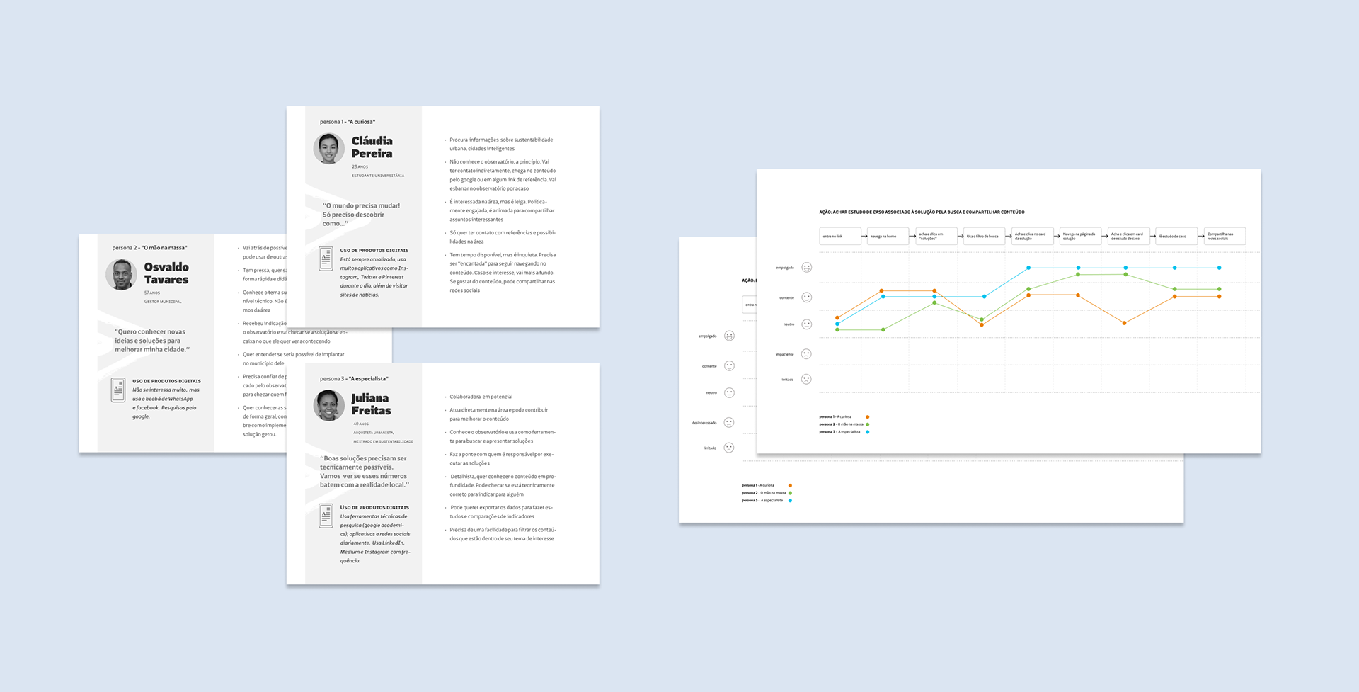
Personas e Jornadas de usuário / Personas and user journey map
Personas
We grouped some characteristics represented in 3 possible profiles that had different levels of knowledge and behavior, as they would have different objectives and interactions when in contact with the observatory.
• urbanist architect, “the specialist”
• Public manager, the “hands on”
• university student, “the curious one”
We also created the three personas as a starting point to later map out journeys, with a step-by-step guide based on some important actions when using the site.
• university student, “the curious one”
We also created the three personas as a starting point to later map out journeys, with a step-by-step guide based on some important actions when using the site.
User Journey
We got to the following hypotheses when creating the user journeys:
• The use of filters in searches needs to be fast and practical so as not to alienate non-expert users.
• It is necessary to increase the distinction and make clear the relationship between solutions and case studies.
• Language needs to be simple and it is necessary to invest in reducing the size of texts and forms.
Our next step would be to create the platform map and then start prototyping.
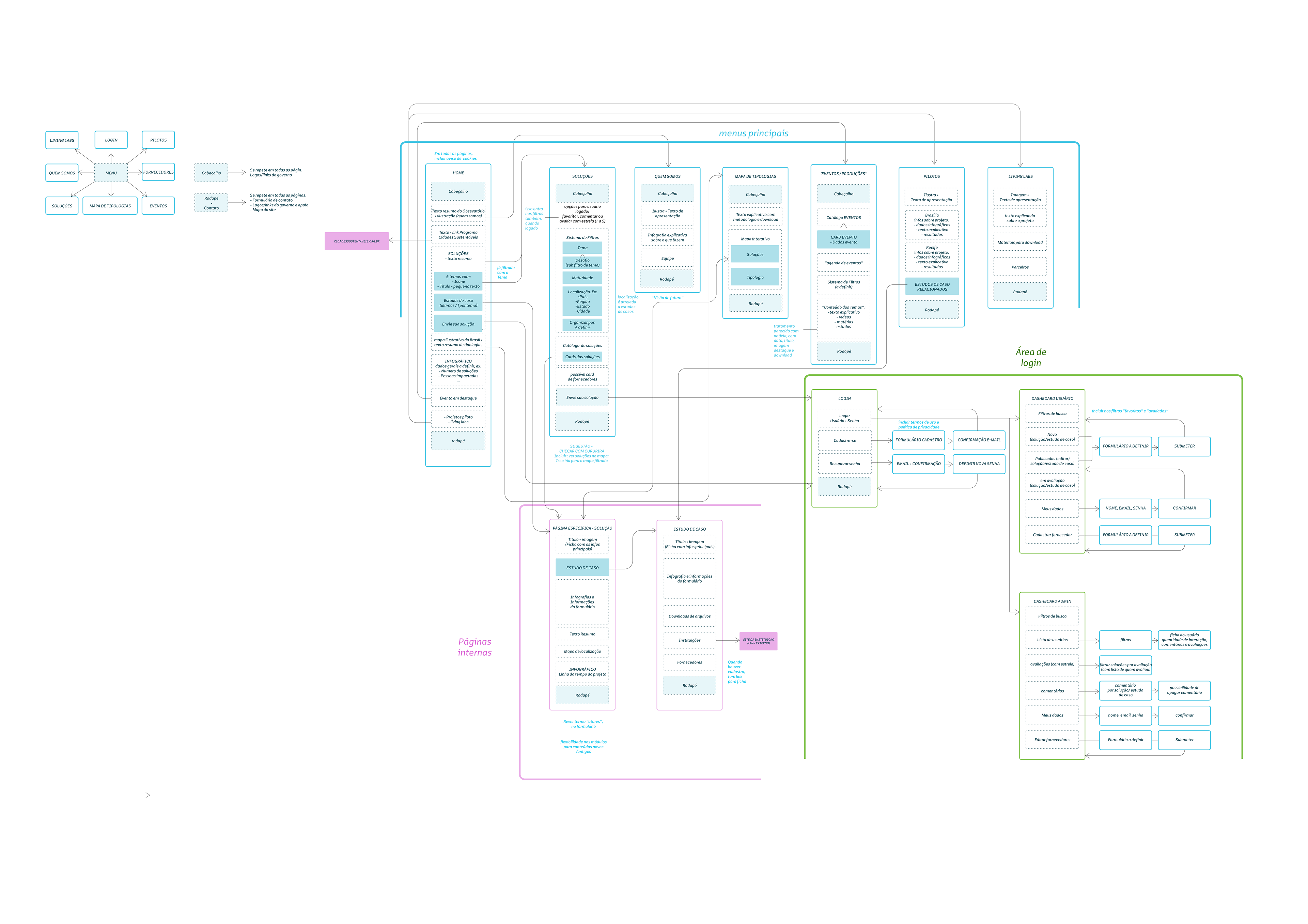
Mapa do site / Sitemap
Wireframe
We started by creating the mobile-first version of the prototype, defining where the information would go, how it would be arranged and what path and interactions the user would follow in the interface.
We would then test some important actions on the platform.
We would then test some important actions on the platform.
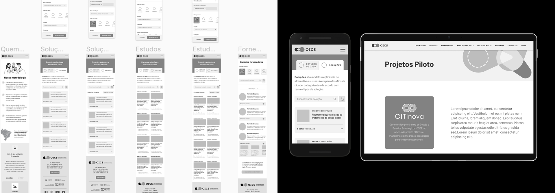
Wireframes e protótipos de baixa fidelidade / wireframes and low fidelity prototypes
user TESTS
The tests had the following goals:
• analyze interactions and improve the experience of potential users when browsing the future Observatory platform.
• collect usability information before we had a finished product, enabling adjustments and improvements and avoiding major reworks in the future, thus making the product more assertive.
Test results
• There was a confusion of the theme filters with the solutions.
• Users were a bit lost, small tutorials were needed along the way to guide, inform and reinforce information about the content.
• Still lacking an explanation that reinforced the relationship between solutions and case studies, both on the home page and on the solution/case studies catalog page.
• Users were a bit lost, small tutorials were needed along the way to guide, inform and reinforce information about the content.
• Still lacking an explanation that reinforced the relationship between solutions and case studies, both on the home page and on the solution/case studies catalog page.

testes de usuários / User tests
Proposed solutions
• Inclusion of short explanation texts accompanied by infographics or illustrations
• Improve the hierarchy. Bigger and more visible titles to help reinforce content blocks
• Make the relationship clear between “themes”, “solutions” and “case studies” through the text.
• Improve the hierarchy. Bigger and more visible titles to help reinforce content blocks
• Make the relationship clear between “themes”, “solutions” and “case studies” through the text.


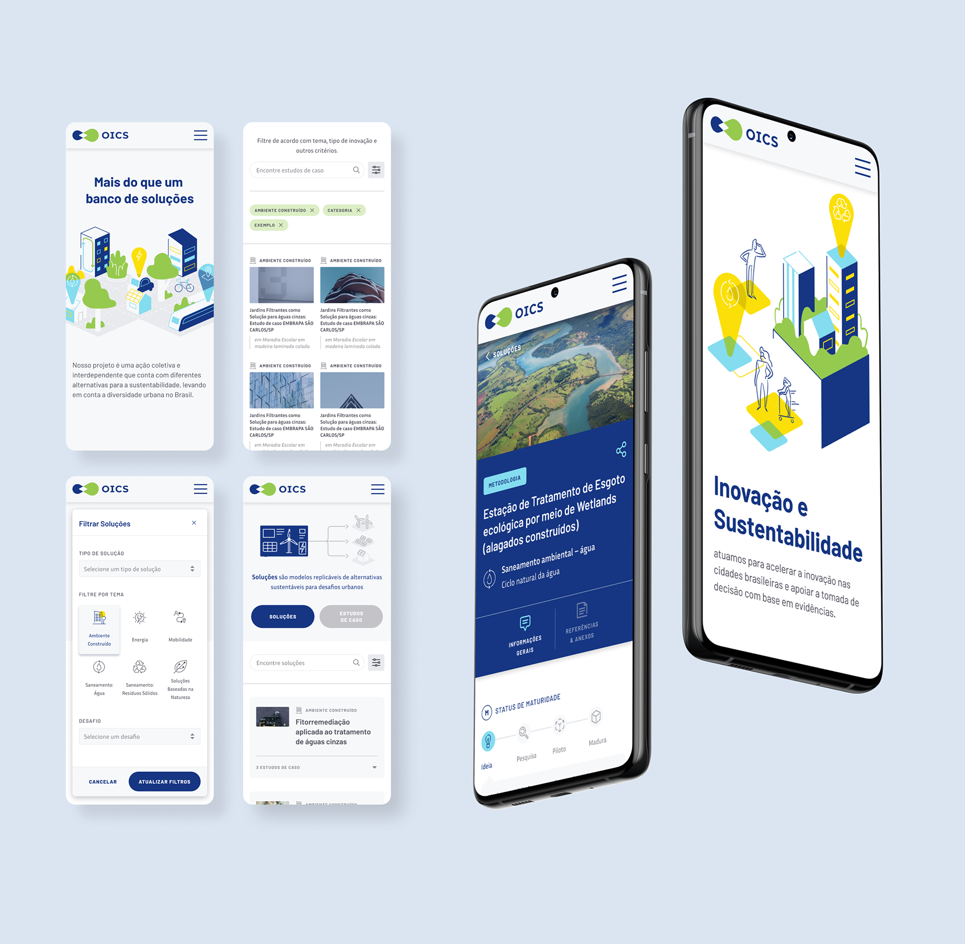
Styleguide
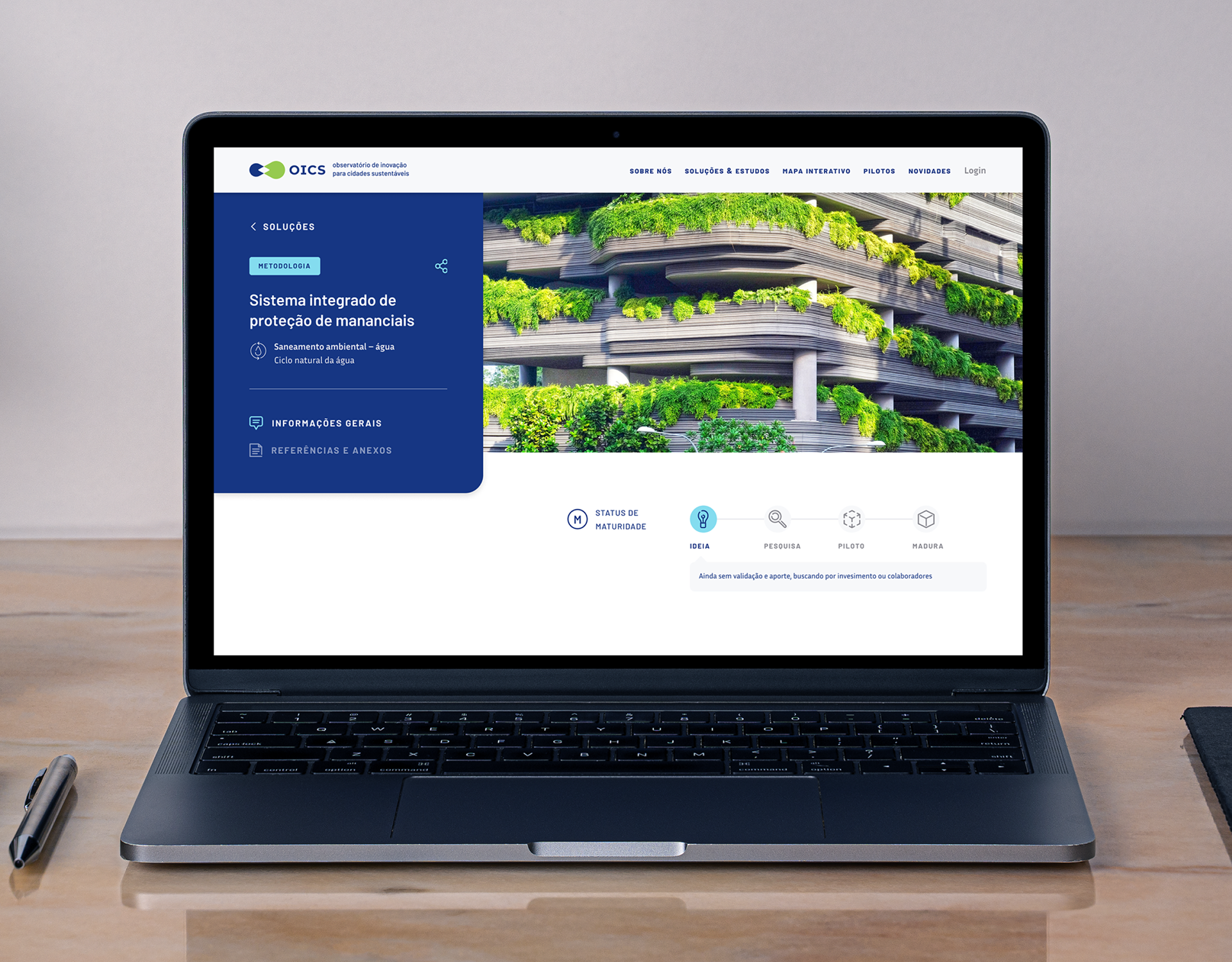
High fidelity prototype
With a more defined interface design, we set the following objectives for the new tests:
• validate changes made after wireframe testing,
• test the arrangement of information on the desktop and
• follow up with necessary adjustments to improve the user experience.
• validate changes made after wireframe testing,
• test the arrangement of information on the desktop and
• follow up with necessary adjustments to improve the user experience.
test ConclusionS and possible solutions
• Need to add more login paths spread across the site to educate user.
• The use of filters and search needs to be more intuitive in the desktop version, making it clear to the user that he is viewing an interactive catalog and that he has options to filter both contents.
• Put more options for direct access to case studies.
• The top of the solutions and case studies section also needs to more clearly show the two options on the page in the desktop version.
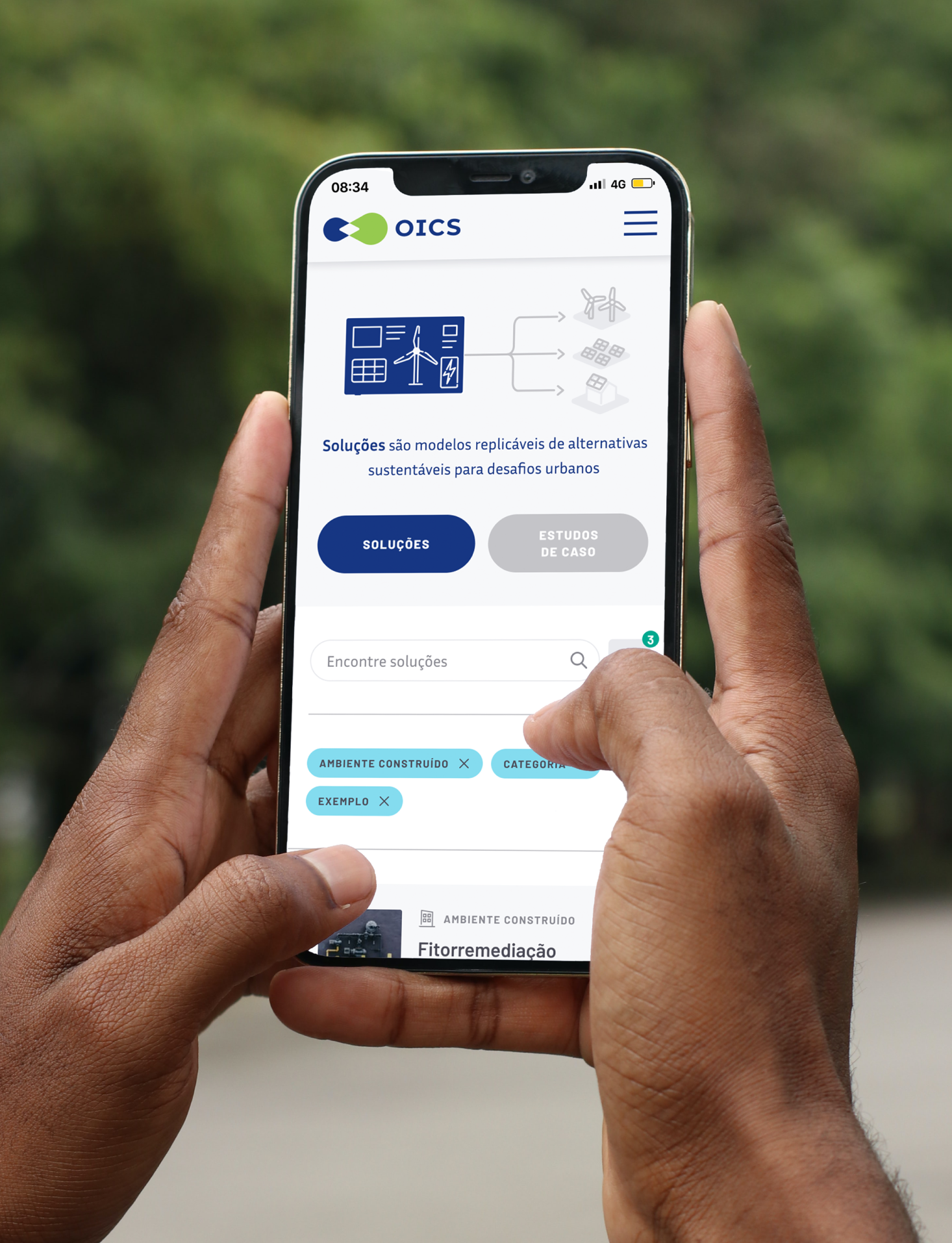

Completion and results
With this information, we finalized the high-fidelity mobile and desktop prototype and started the implementation. It was a process that involved the integration of the CMS with the API developed by the observatory to link with their database.
I followed the implementation process by testing and validating operation and interactions. The new version was recently launched and already has a good reception at the events where it was presented. Users who have had contact with the older version have reported a great improvement in usability.
It recently received an award at the "Design for a Better world awards 2021", an award that aims to give voice and visibility to those involved in creating positive impact solutions through design.


